UX Meter | Chrome Extension Guide Skip to main content
Unable to read this document due to uneven font sizes? Use UX-Meter 's insta-fix to automatically adjust the font size to a comfortable, readable level.While we understand that the work may look great, the real question is — is it user-friendly? This is where UX Meter plays a vital role, helping you ensure that your design not only looks appealing but also provides a seamless and intuitive user experience.
We've made sure that we don't just impose our rules on you forcefully. Instead, UX Meter allows flexibility through our JSON-based ruleset upload system, which stores your preferences in your browser's local storage. No worries — none of your design philosophy data will be shared with others, ensuring your work and creative choices remain private.
With UX Meter, you can customize validation checks, and prioritize specific design guidelines. Whether you follow strict accessibility standards or prefer a more creative, experimental approach, our tool adapts to your workflow.
The upcoming updates will introduce advanced features including automatic detection of visual hierarchy issues, and contrast ratio checks. We want UX Meter to be your personal quality assurance assistant in the design process.
Ultimately, UX Meter isn't just about pointing out faults — it's about giving you actionable insights so that your designs are both beautiful and highly usable, helping you deliver products that users will love.
While we aim to keep this documentation concise, we believe it's important to help you understand what UX Meter is and why it matters. Our goal is to show you how UX Meter can enhance user experience by highlighting key aspects of usability, accessibility, and interface design.
Categorization
-
Errors
Errors are critical findings likely to break core experience, accessibility, or cause user frustration.
For example: Duplicate IDs, empty buttons, broken links, and missing alt attribute on critical images. -
Warnings
Warnings highlight non-fatal issues that might reduce UX quality, such as poor contrast or usage of inline styles.
These should be addressed, but may not always result in immediate breakage.
Why Inline styles is an issue?
Inline styles make it harder to maintain and consistently update
appearance across your app.
They are also hard to override with your themes or user
stylesheets.
Developers may forget to maintain these one-off styles, resulting in
visual bugs.
Duplicate IDs issue?
If multiple elements share the same ID, assistive technology, screen
readers, and JavaScript queries
all fail to behave as expected.
Duplicate IDs are invalid in the HTML spec and can cause scripts to
malfunction.
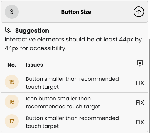
Button sizing
Min Size
Buttons must have a minimum height & width of 2.75rem, i.e., 44px.
Min Icon Size
If a button has an icon, the button's look depends on 2 elements -
-
Icon
Users commonly look at icons to instantly grasp what a particular action or detail is, unless it isn't clearly understood. There are times when first-time users rely on text labels for clarity, but eventually, they navigate effortlessly by recognizing icons alone. That's why icon sizing plays an important role — it's not just about aesthetics but also about navigation consistency, visibility, and accessibility. A well-proportioned icon can improve recognition speed, reduce cognitive load, and guide users seamlessly through the interface.
-
Text
Text is one of the most vital elements of any user interface — it communicates meaning, guides interactions, and defines the overall tone of your product. However, readability depends on multiple factors such as font size, weight, spacing, and contrast. When text is too small, cramped, or lacks sufficient contrast, it strains the user's eyes and hinders comprehension.
The goal is to maintain a perfect balance between visual hierarchy and comfort. Larger, bold fonts help emphasize actions or headings, while smaller, lighter ones work well for secondary information. Proper scaling and responsive font adjustments also ensure that users have a consistent reading experience across devices. In short, clear and well-sized text makes your interface both elegant and effortlessly usable.
Below are two buttons that have a visually appealing design—certainly better looking than traditional buttons—but they suffer from a smaller touch area. While they function well and look good, the limited user touch area can sometimes affect user-friendliness and make them harder to interact with, especially on touch devices.
Hint: Use UX-Meter's "Fix" located for categories:
- Button size
- Touchable Icon Button size
What's so special about UX Meter?

UX Meter not only checks and highlights issues—it can also
suggest or autofix some problems in your interface.
Only minimum button sizing, icon sizing, font weight, and font size
are currently auto-fixed, with more features coming soon.
Each flagged issue comes with a clear explanation and suggestions. Decide easily between fixing or ignoring. For best results, resolve all listed errors. Lingering issues will eventually cause user pain points.
UX Meter also lets you define custom UI/UX validation rules using your own JSON templates—for example, enforce brand color contrast, or flag deprecated button types.